This is about a UX pattern that’s completely unacceptable. When I encounter it, it makes me want to set fire to all the technology in my life and move into a cave. I’m certain you’ve seen it too and I’m confident it drives you nuts too.
I call it Dead Till Updated, in this case it’s happening in one of my least favourite pieces of software, the SONOS Mac App, though the SONOS iOS App is also pretty awful.
I’ll write a bug report to explain it.
How to repeat: Open the SONOS Mac app to turn the volume down on your TV Playbar
What happens: The app is unusable and demands I update the software. My TV remains on a cripplingly loud volume waking my children and annoying my spouse because I can’t turn it down.
What I expect to happen: To be able to turn my TV down without performing the update.
I mean, what’s happening here? Who makes a decision to cripple a physical device in your house in this manner? It’s offensive.
I refuse to believe anyone who tells me there is a technical reason why the core functionality could not still be presented here without doing a software update. That is total bullshit.
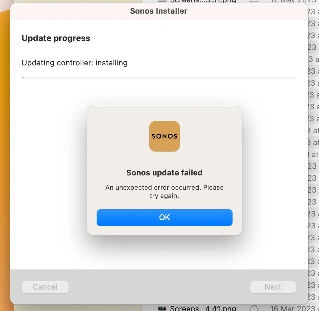
More frustratingly when I actually attempt the update, it fails! I’m sure this is something I will work around but there are plenty people for whom this would be a dead-end.
I know, it’s SONOS, what should we expect. I know, it’s not a life support machine. I know, I could get off my arse and walk over to the TV and turn it down physically (I did do that) but come on man.
Whoever decided this was a good path to send people down needs to have a fortnight off work and come back with a clear head. Or maybe choose a different career.


